
Bootstrap Cards (GitHub, Demo) is a simple Bootstrap template I built about a year ago (and still maintain today) that implements card-based design. It’s built on HTML, JavaScript & Sass (compiled to CSS) and incorporates a few open-source JavaScript & CSS plugins/libraries for animations and icons.
I created Bootstrap Cards because I wanted to learn Sass, become fluent with Bootstrap and explore the basics of web design. Through the project, I also managed to pick up Gulp and Bower, which are now irreplaceable tools I use for all my front-end projects.
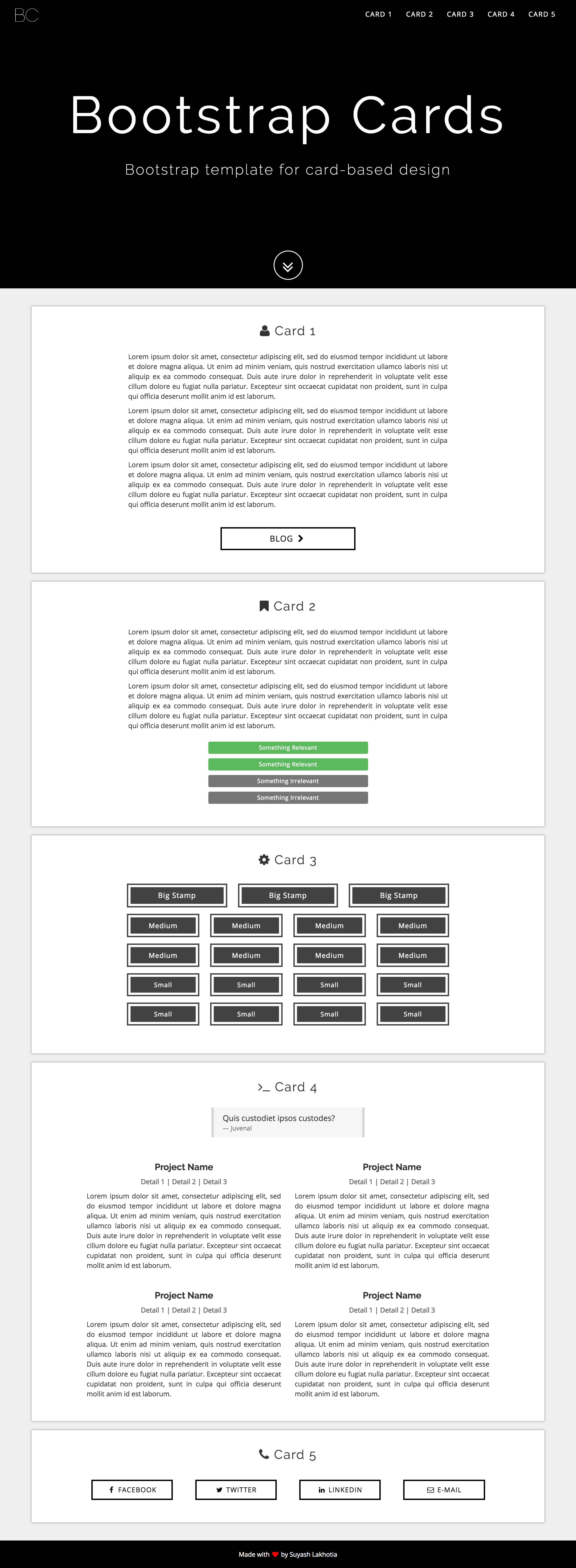
There are three main templates within Bootstrap Cards. The first is a template for a one-page website or home page, which I also use for my personal website.
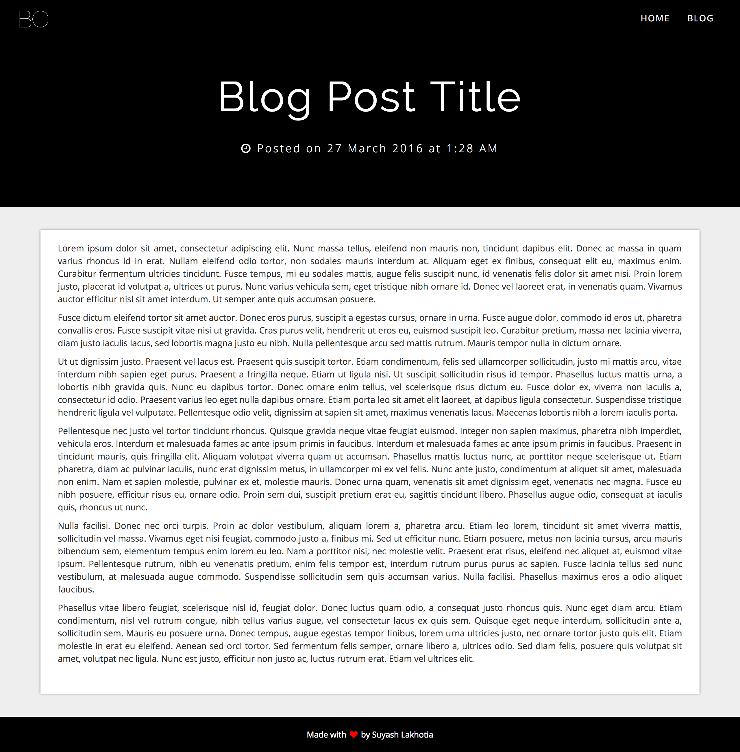
The other two templates are for a blog-like website. The first is a template for a blog home page with links to all the posts and the second is a template for the actual blog posts.
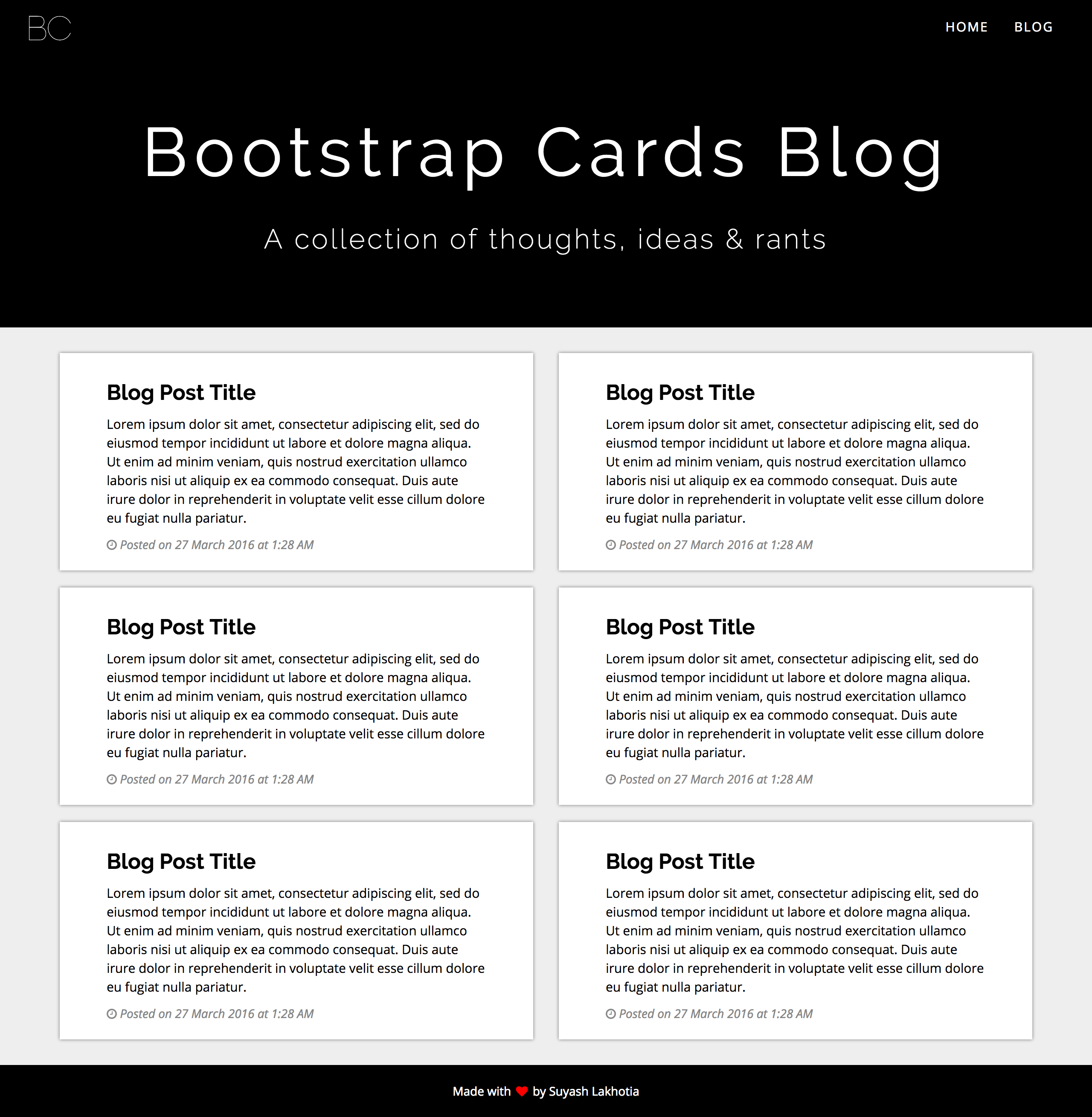
While the template does implement its own typography, navbar and other components, the main idea behind Bootstrap Cards is the cards, which was fairly simple to implement using Bootstrap’s grid and some custom CSS (below).
<!-- Example of Card on Home Page -->
<div class="card-wrapper card-big">
    ...
</div>

<!-- Example of Card on Blog Home -->
<div class="card-wrapper card-small">
    ...
</div>
.card-wrapper {
    position: relative;
    background: #fff;
    box-shadow: 0 0 5px #777;
}

.card-big {
    margin: 20px 0;
    padding: 20px 30px 40px 30px;
}

.card-small {
    margin: 10px 0;
    padding: 10px 40px 10px 40px;
}

@include small-screens-only {
    .card-big {
        padding-right: 10px;
        padding-left: 10px;
    }
    .card-small {
        margin: 25px 0;
        padding: 20px 10px 30px 10px;
    }
}